With marine pollution being another detrimental environmental impact to the ocean and all it's habitants, I was keen to use this specific issue as a starting stimulus.
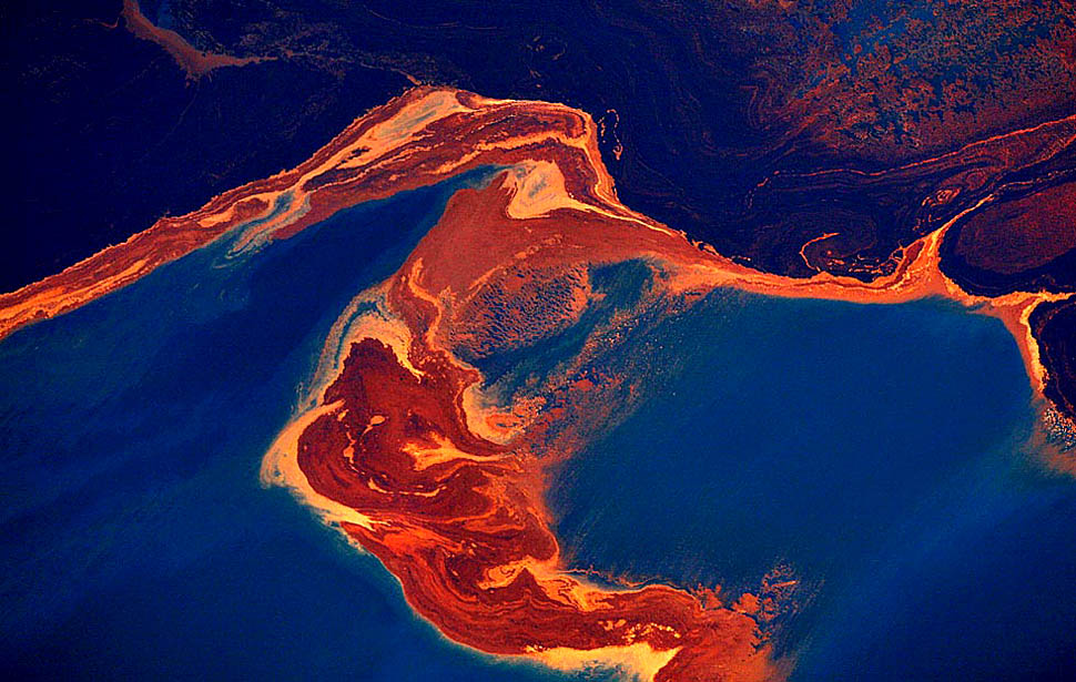
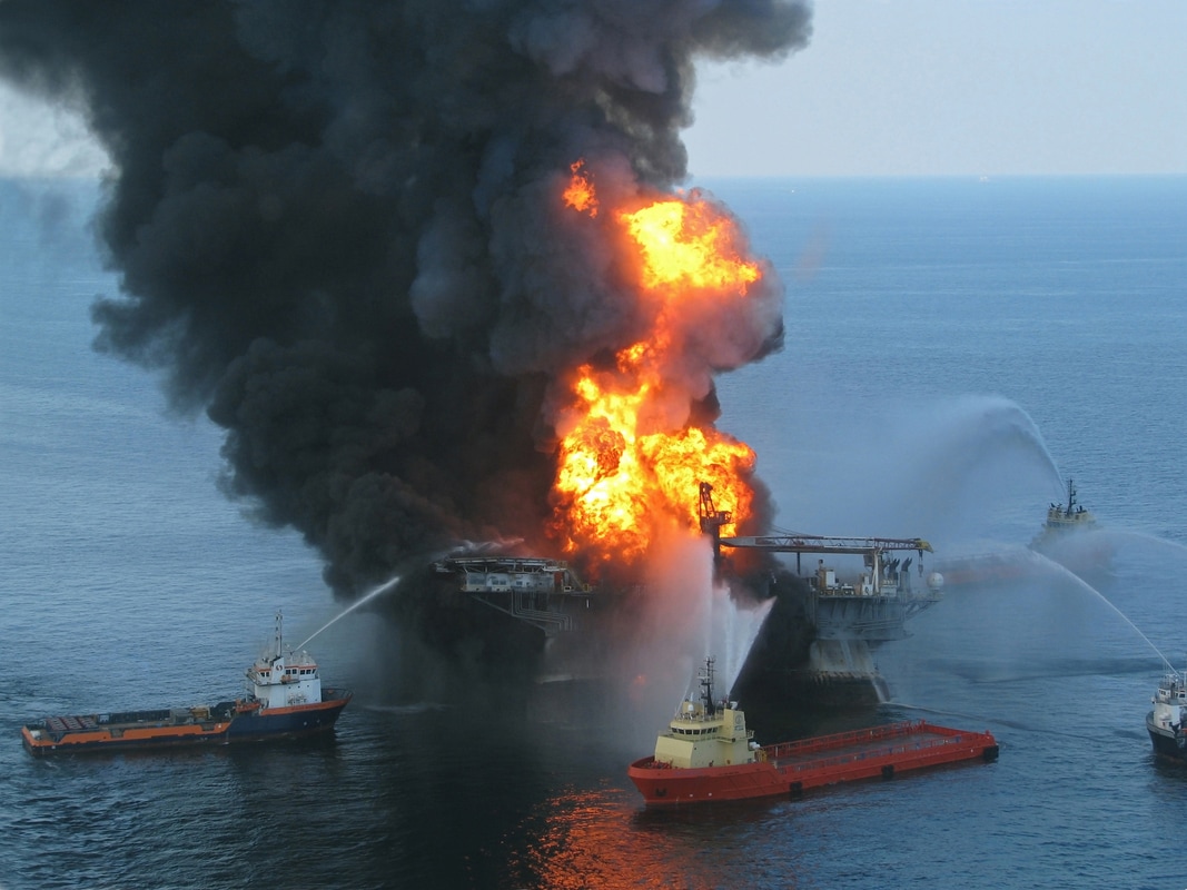
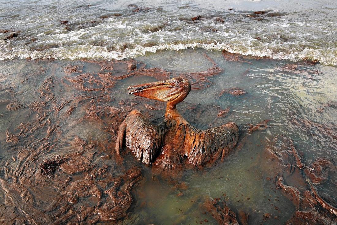
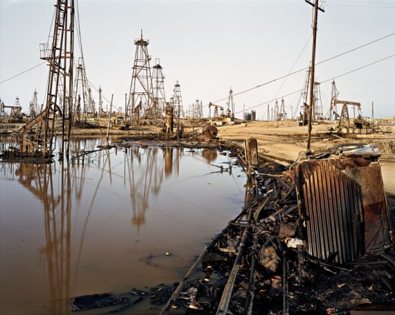
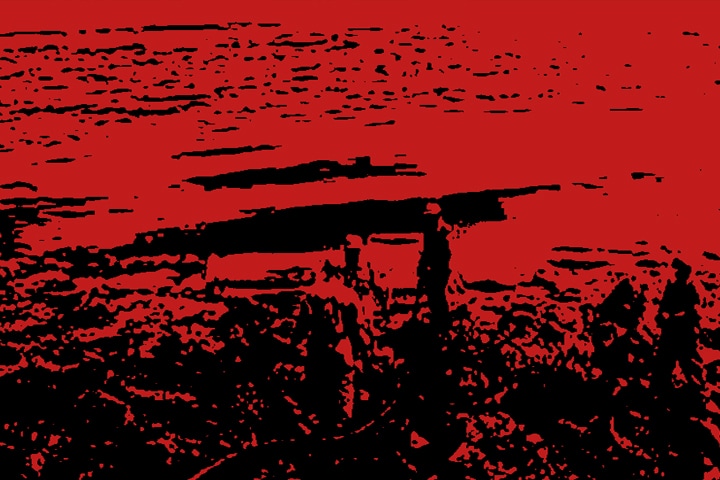
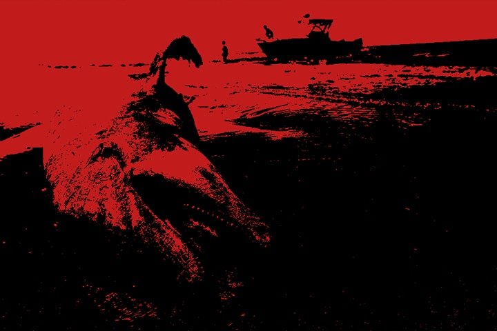
An oil spill can happen either on land or on sea and when spilled on water it prevents marine animals to survive. In 2010, the BP oil spill was the largest in U.S history. More than 200 million gallons of crude oil were pumped into the Gulf of Mexico for a total of 87 days. 16,000 total miles of coastline have been affected, including the coasts of Texas, Louisiana, Mississippi, Alabama, and Florida.
An oil spill can happen either on land or on sea and when spilled on water it prevents marine animals to survive. In 2010, the BP oil spill was the largest in U.S history. More than 200 million gallons of crude oil were pumped into the Gulf of Mexico for a total of 87 days. 16,000 total miles of coastline have been affected, including the coasts of Texas, Louisiana, Mississippi, Alabama, and Florida.
Some images showing the impacts of the BP oil spill.
Artists work
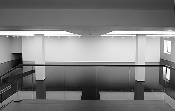
Richard Wilson is an english sculptor, artist and musician. Wilson's projects are characterised though his interest in architecture and engineering. His aim is to "tweak or undo or change the interiors of space... in that way unsettle or break peoples preconceptions of space, what they think space might be". His most famous works include '20:50' and 'Turning the Place Over'.
|
|
In the piece :'Turning the Place Over', Wilson cut an 8-metre diameter disc from the walls and windows of the building, attaching it to a motor which literally turned the section of the building inside out. Liverpool Biennial organisers described it as his "most radical intervention into architecture to date" |
|
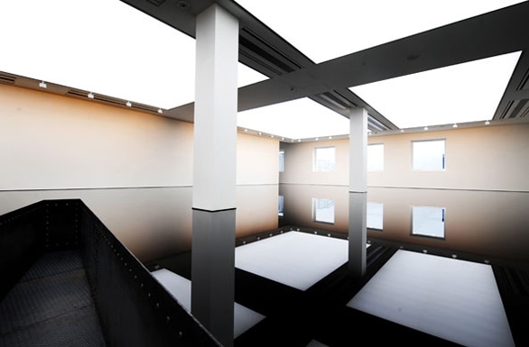
'20:50' consisted of filling up a tank of oil, laid flat, giving a mirror like appearance in the gallery. Wilson has taken dense crude oil and created an abstracted space; distorted from the highly reflective oil's surface. This idea was drawn from his ambition to alters ones perception of a space. It is considered to be a defining work in the genre of site-specific installation art. |
|
“[we] come from nature.…There is an importance to [having] a certain reverence for what nature is because we are connected to it... If we destroy nature, we destroy ourselves.” - EB
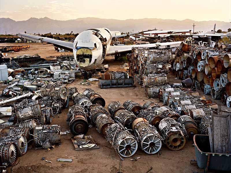
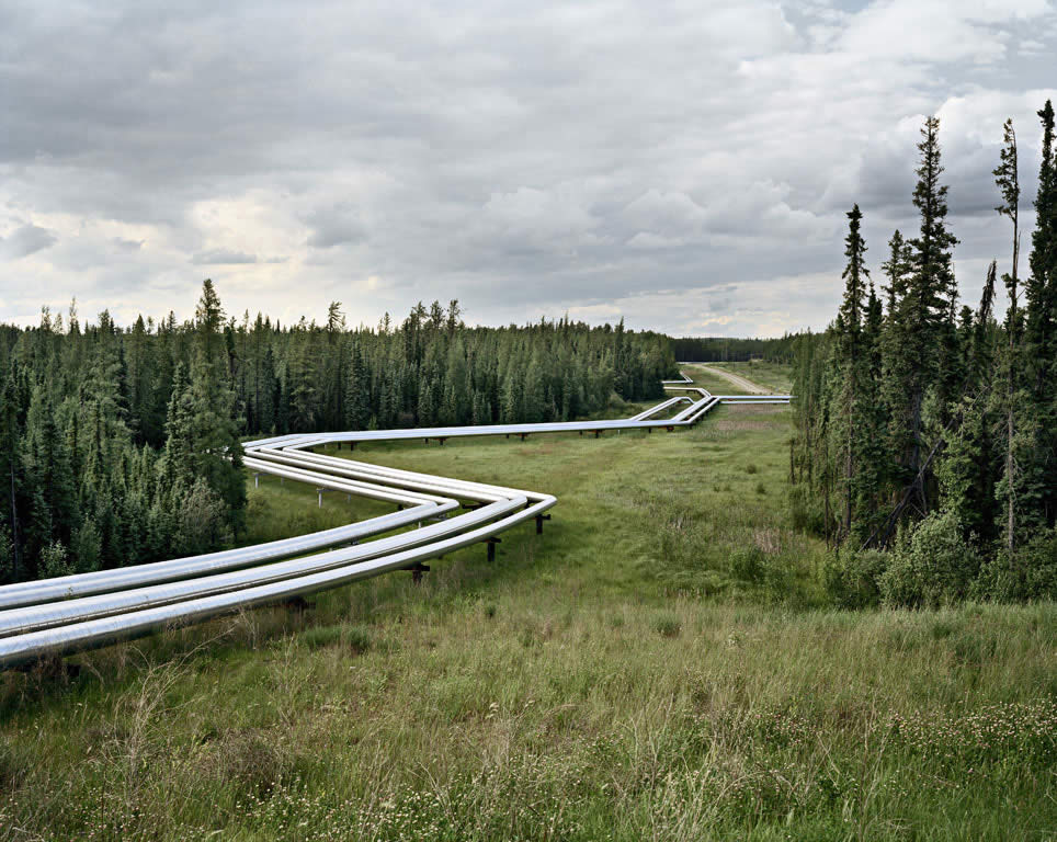
Edward Burtynsky created a photo book entitled 'Oil' in which the oil industry is documented with its causes and effects. Burtynsky took interest how beneficial yet destructive oil is towards our environment with a particular focus on Chinese industrialisation. These photos were taken over ten years, researching and photographing the largest oil fields he could find. His work confronts us with the evident global dependence of oil and how its supply may soon run short. I find these images visually powerful. The discarded jet engines and aeroplane covering an apocalyptic looking wasteland adds a dramatic element to the image. In the second photo, I feel the strong lines produced by the metal pathways show the intrusion of industry within the natural world.
photos from 'Oil'
Development work |
,
American photographer David Maisel conducted a project entitled 'Black Maps'. In these images Maisel frames the aesthetics of the natural extraction process. There are identifiable visual links, tied together through the similar choice of composition and scale. I feel the abstracted shapes are emphasised through the black and white after effects, revealing the Earth's consumption of such resources. |
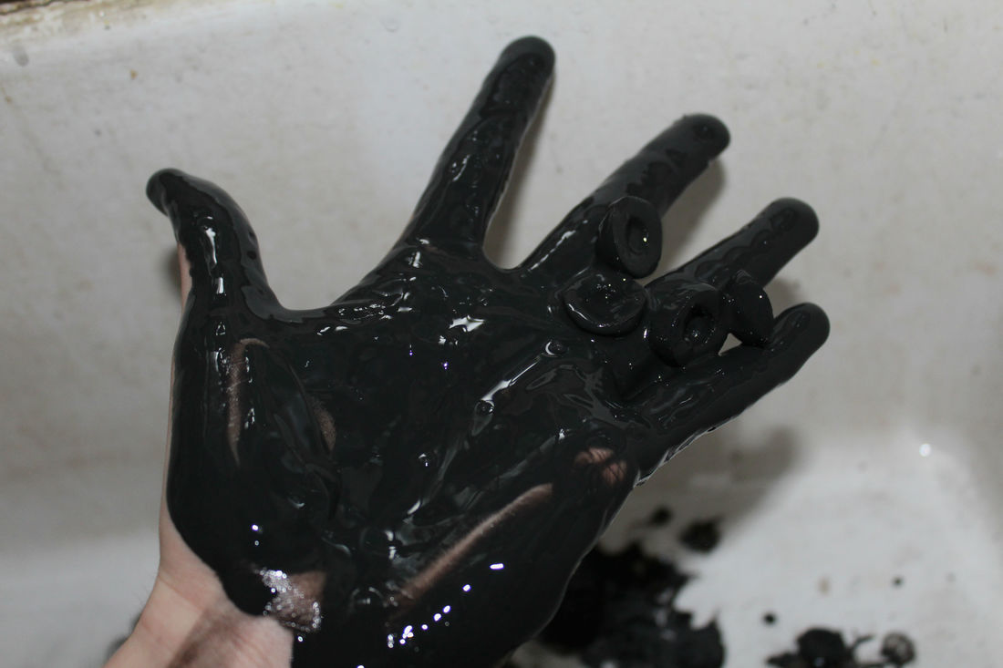
In the first stages I have been experimenting with replicating the properties of oil to use as a central focus to my images.
Here is a short video, exploring some of the movement and characteristics of oil:
Here is a short video, exploring some of the movement and characteristics of oil:
|
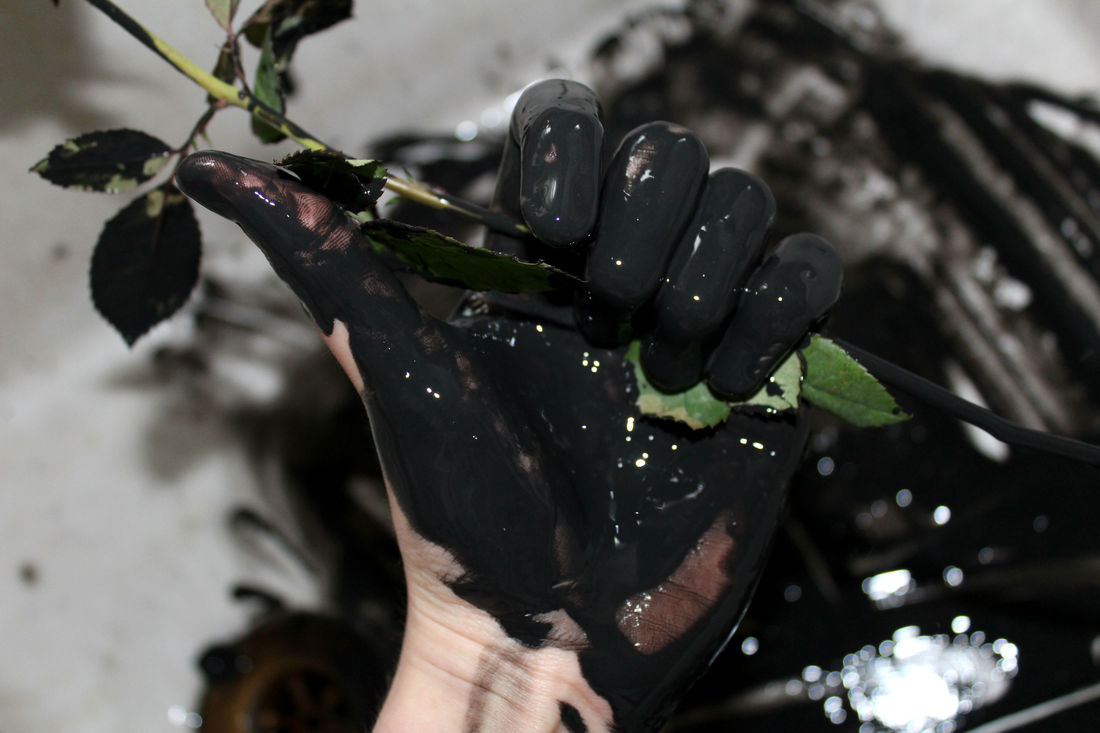
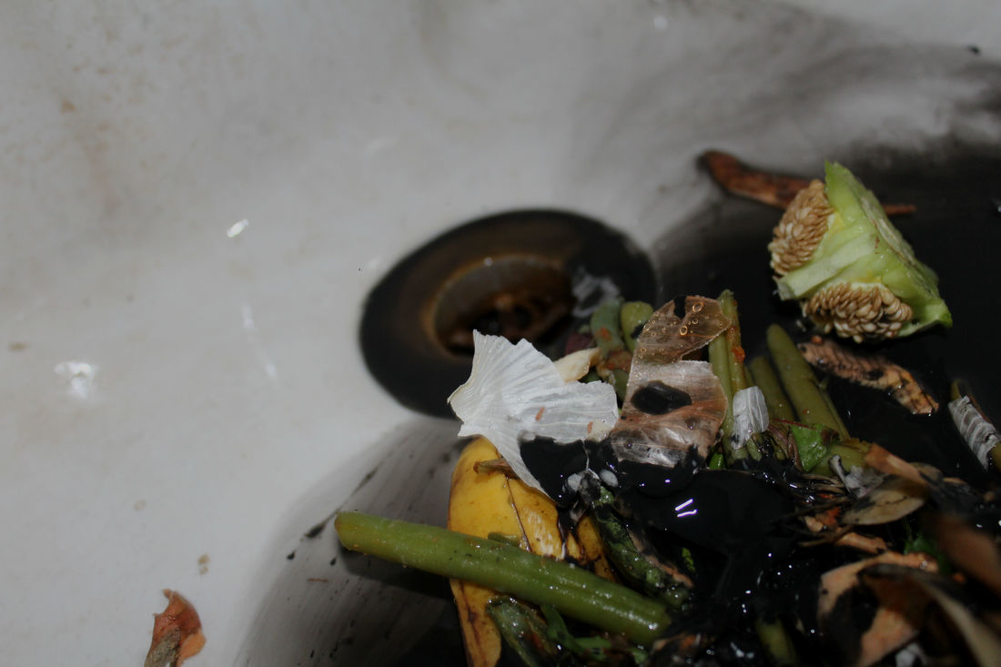
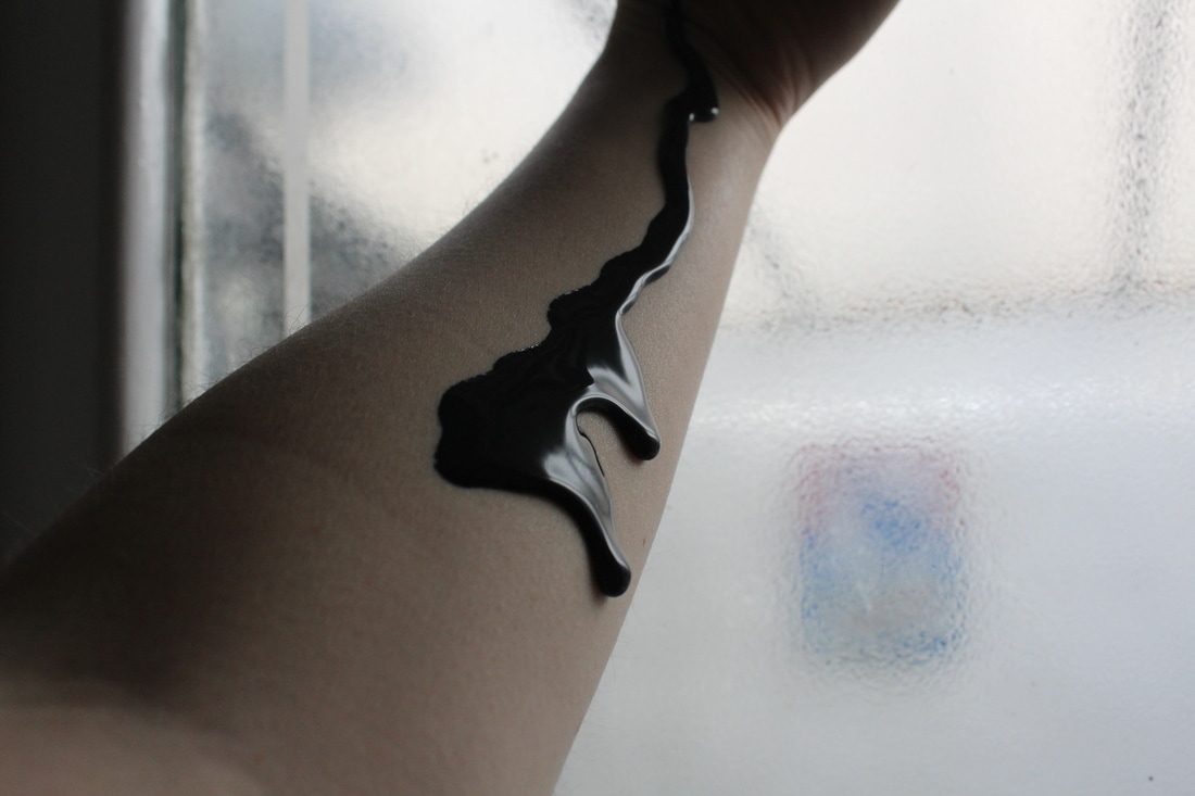
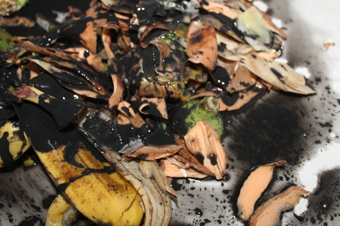
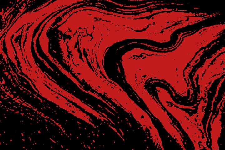
These are some experiments where I mixed black poster paint with water to try resemble the appearance of crude oil. Through the use of flash photography I could capture a sheen texture making giving it more of an oil like look. I wanted to experiment with how the paint disrupts an image through using a rose and food scraps. |
|
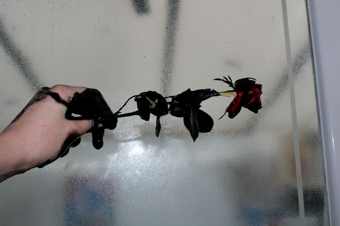
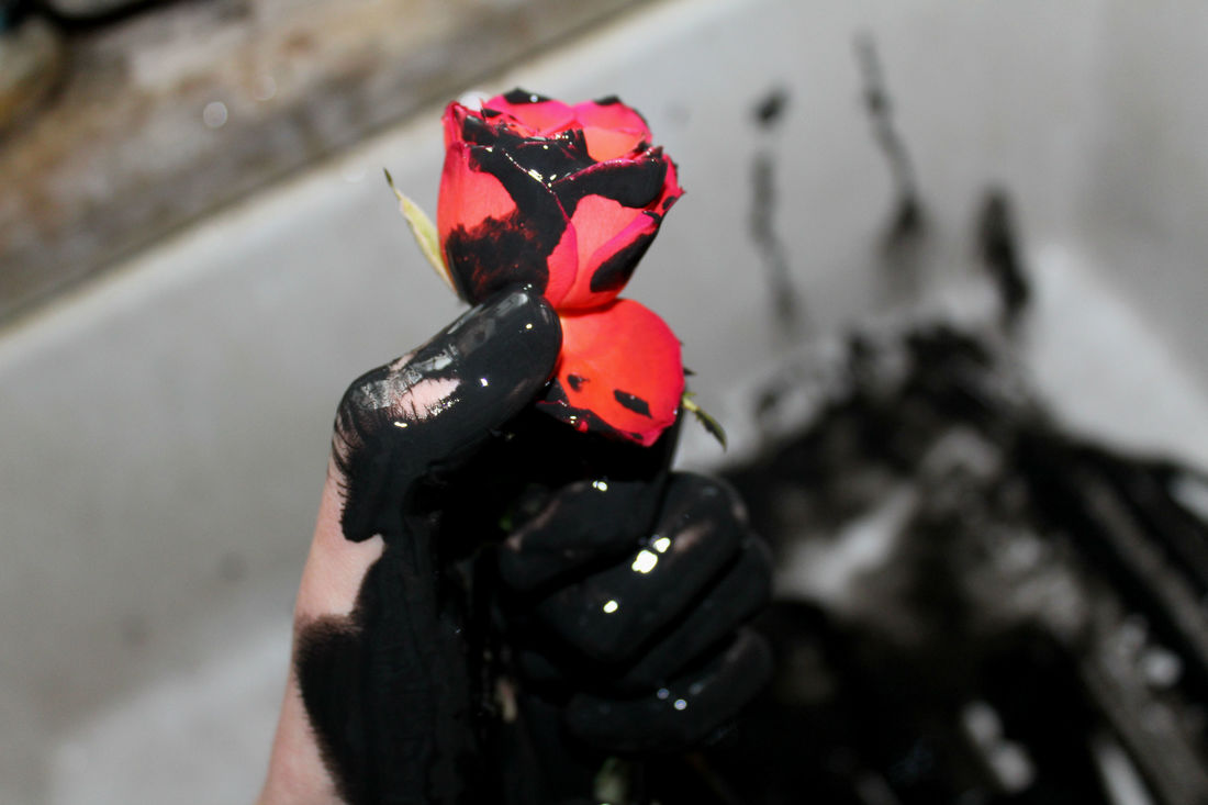
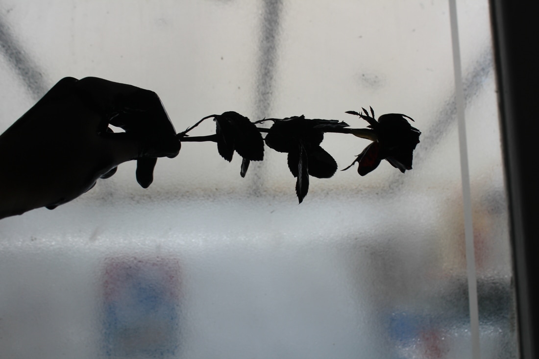
I was most drawn to the images which involved a red rose. I created a short video from a few of those particular images, seeing whether the quick transitions would successfully animate the photos.
|
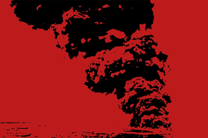
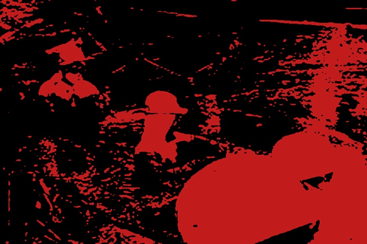
I wanted to develop this sequence further. Due to the fast pace I felt it could be effective to flash several images displaying the impacts of an oil spill in-between frames. I was drawn to the recurring red and black tones within each image and felt I could maintain the strong contrasts with the new photos in-between. To do so I adjusted the threshold and saturation in photoshop to colour the images black and red. |
|

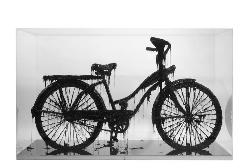
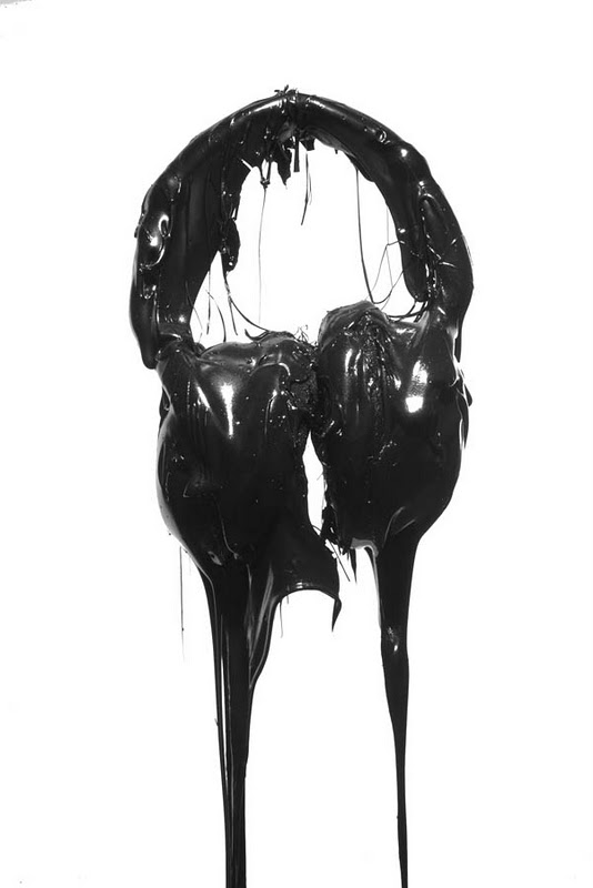
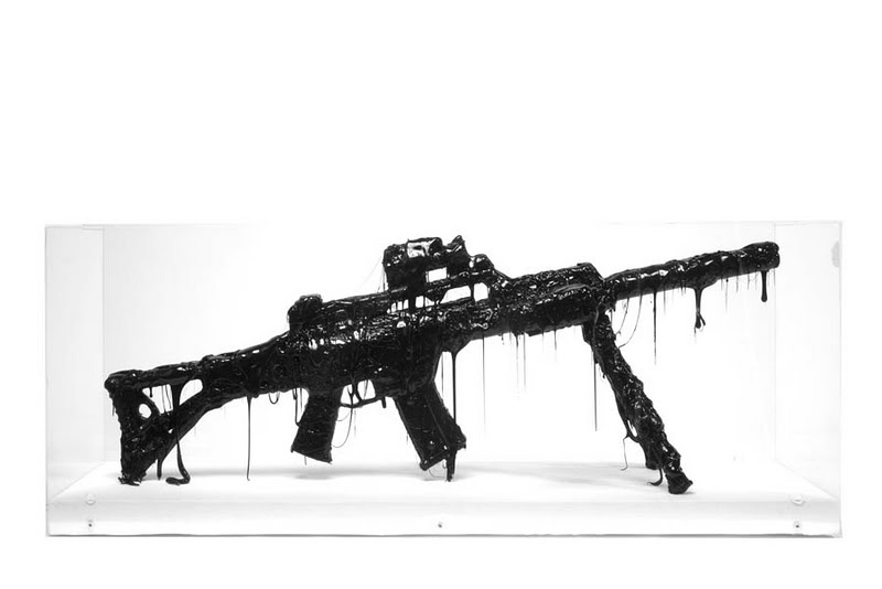
Another artists work I was drawn to was a series of disrupted images by Italian artist Mattia Biagi. He explored the visual values of tar, covering various objects with it amongst a white backdrop.
"I was intrigued with tar as a medium and how it illuminates and highlights objects in a very esoteric and ethereal sense."
Mattia Biagi
|
It is visually evident of the disruption tar gives, changing the form and texture of an object. Biagi's objective observations were something I wanted to replicate but through using 'oil' instead. To make a mock oil I used black acrylic, black ink and PVA glue to create more of an accurate representation of oil than in my previous experiments. Under a studio setting I could experiment with how the paint mix would fall and cover different objects. Through choosing to shoot portrait I could capture any dripping/spill movements down the plinth. I chose 4 objects: roses, grapes, The Bible and a motor bike helmet. |
|
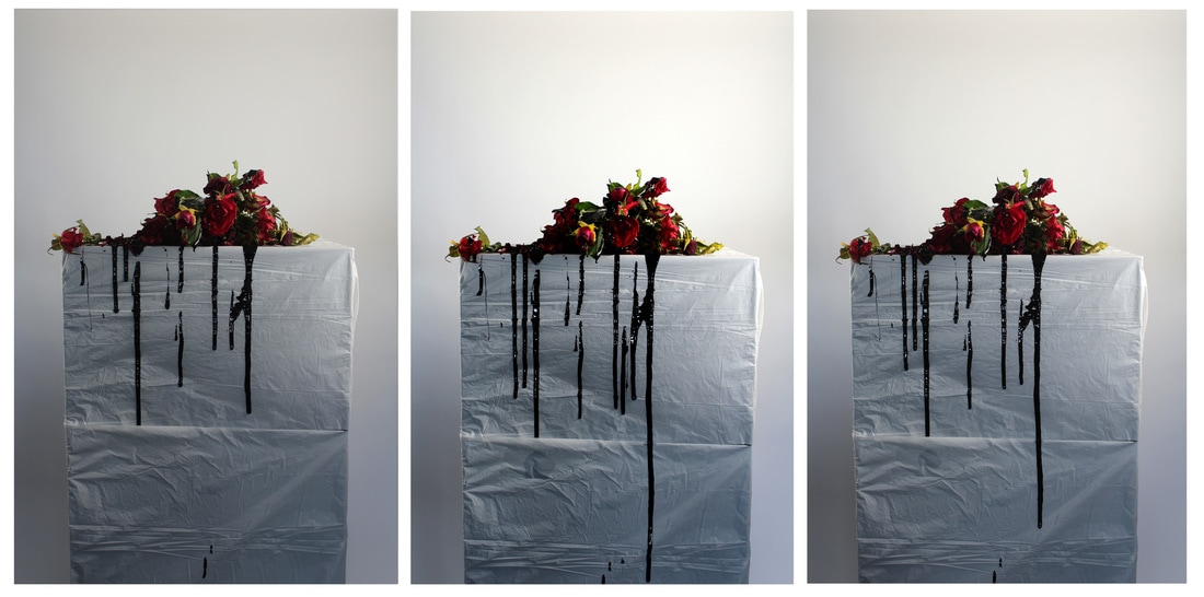
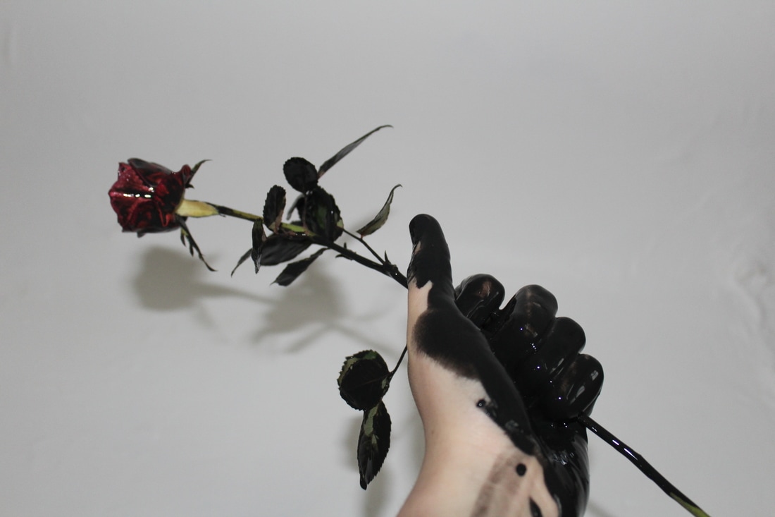
I chose to use red roses again for I felt the red/black contrasts visually worked well in my first experiments. Another visual strength in these images is the shapes created from the black lines falling over the front of the plinth. Through covering the plinth in white plastic bags, I could create a smoother surface for the paint to run down.
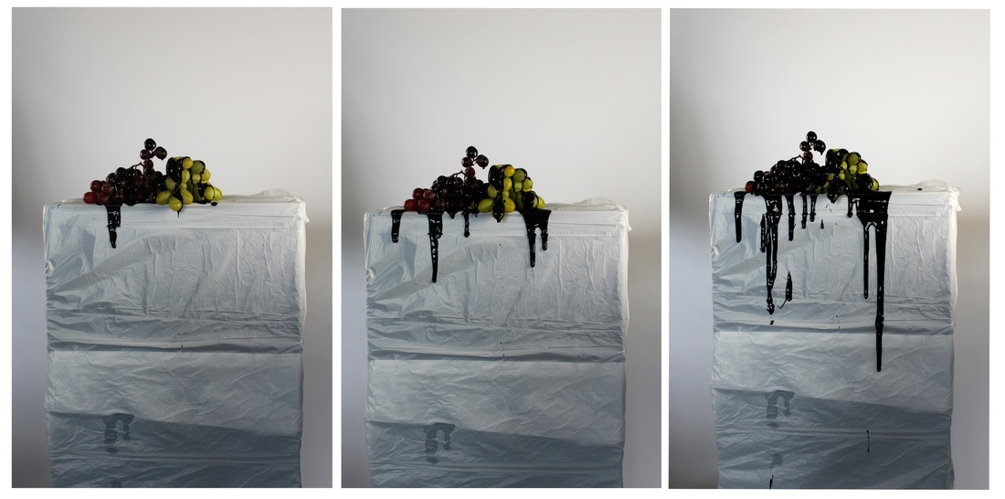
I felt grapes would be an interesting object to shoot. I wanted to capture how the paint would fall over the differing spherical shapes of them. Through choosing to display the images in a triptych form I could show the effect of the paint, adding more over time; exploring the visual changes between the three.
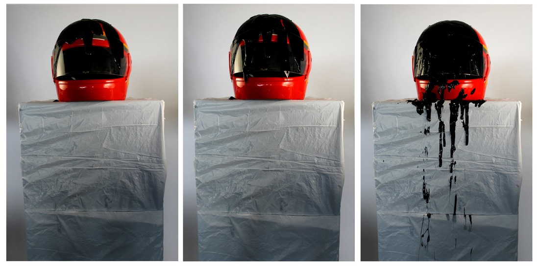
These images have more of a contextual value. With oil and petrol both being fossil fuels and contributing to our carbon footprint, the helmet is representative of motor vehicles and the impact of petrol and diesel on the environment.
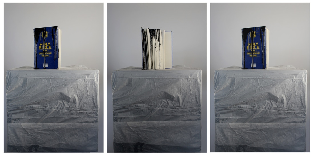
With many placing the earths future in God's hands, I felt the Bible may be a relevant object to shoot. My favourite photo is with the open pages. Showing the 'oil' painting over the words between the pages.
Overall I felt my images were successful; with the correct technical settings I was able to capture a clean set of studio shots and with similar compositions I could compare the visual differences between them in triptych form. I did however want to change the composition of some of these images as an attempt to abstract them further. Keeping the the colours of red and black I added shape to these images to see what emerged.
With the colour balance being the element I was changing, it meant I could vary how much of the photo is being shown and how much replaced by colour. At times I feel the black shape works better in the image, representing the oil as it fills up the photo at various levels. However the red is more of a visual contrast clashing at times with the image underneath.
